|
If you knew the first edition of my deck you will notice that a few cards look different now.
Below, I present the cards whith he the most major changes in the second edition. I also explain why I made the changes.
The cards you see at first are the new, up-to-date version,
but if you hover over them with your mouse the old, first edition version is shown for comparison.
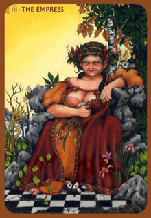
III - The Empress
In this card, I elongated the "outer" part of the Empress' skirt, the dark red, heavy cloth, right down to the ground.
In comparison to the earlier version in which it only reached down over her knees, the Empress is now rooted with the ground much stronger. This is such an important part of her meaning: the strong connection with the Earth.
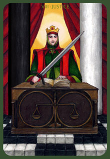
VIII - Justice
As you can see I inserted two pillars: a black one and a white one. I did this for symbolical reasons.
Because one of the most important meanings of Justice is the ability and the courage to differentiate between black and white. Even though it is probably true that in reality there never is black or white but just an infinite number of shades of grey, we can't act like that. For example, you can be of the opinion that a certain punishment for a certain crime has both good and bad aspects - but then, legally you either allow this sort of punishment or you don't. You can't allow it "a bit". You have to decide which side you are on, even if you know that neither side is a hundred percent right. Even suspending your judgement is a decision about black or white - in this case it is the decision that suspending the judgment was more right than making it.
The problematic aspects of Judgment - to be overly strict and unable to reverse one's judgements - is also expressed very well by the two pillars, I think.
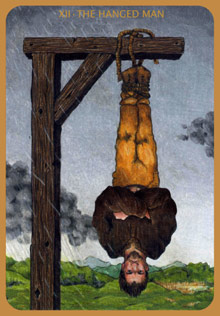
XII - The Hanged Man
In the earlier version, the Hanged Man had his hands in his pockets. In the up to date version they are crossed over his chest.
In my opinion, this expresses his mindset of refusal better.
And as you can see I also "hanged him up a bit higher" - for aestetic reasons, for a better balance of the picture as a whole.
XVII - The Star
The Star I re-design completely. On the one hand, I wanted to construct a stronger connection with the other three celestial bodies (Sun, Moon, World), so with the new version of the Star I waived the human figure.
On the other hand, the Star in its earlier version had always been a temporal solution. It was the best I could do at the time but it didn't represent exactly what I felt it should. The new design expresses the meaning much clearer. The water, as the promise of life, is still there, but now it is moving - something is happening. Slowly, maybe, but steadily. Hope is expressed in the sapling which grows next to the spring - it is as if the light of the rising star was encouraging it to grow.
If you compare the colouring of the up to date version of the Star with that of the World you'll see that they are quite similar. For me, the sapling which in the Star has just started to grow is the same one that has grown into the big, strong tree in the World.
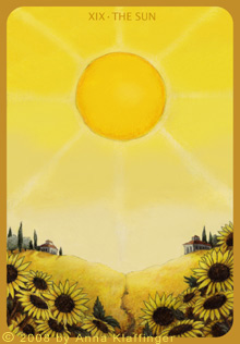
XIX - The Sun
I also completely re-designed the sun.
One reason was that I wanted to make its connection to the Moon more apparent, so as with the Moon (and the up to date Star) I didn't depict any human figures.
Another reason for not using human figures was that in the ideal case the joy the Sun represents is not dependent on the social surroundings but comes from within.
And, last but not least, in my opinion the new design makes it easier to see why the light and the heat of the Sun can also be oppressive if there is no shadow, no darkness into which you can withdraw for a while.
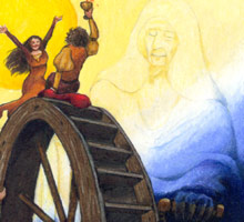
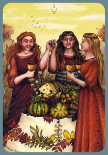
The Three of Cups
With the Three of Cups I changed the background. In the new version, the three women don't stand infront of a curtain but outside on a field in the late summer / early autumn evening light. This seemed quite fitting to me, considering that the meaning of the card is thankfulness for that which one has been given, and one of the major feasts where people said "thank you" in rural Europe were the harvest festivals.
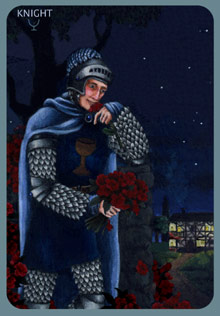
The Knight of Cups
Here, I added the red roses, so the romantic, dreamy mood of the Knight of Cups would come out clearer - before, I thought he was almost a bit too sober!
I think it is also much clearer now that a loving, romantic, dreamy mood can also have something wearing, almost presumptuous.
|
 |